While the user experience in email isn't as complex as navigating an app or website, there's still much to consider to make it quick and logical for the audience, which in turn helps garner more conversions for the business.*
EMAIL BEST PRACTICES
Keep content concise. You only have about 11 seconds (at best) to pique the reader's interest enough to take action.
Hick's Law states that the more choices or types of messaging depicted, the harder it is for users to make a decision, which could lead to cognitive overload and abandonment. Avoid multiple CTAs when possible.
The UI stylizing and placement of your CTAs can help the user understand what you primarily want them to do, and what might be a secondary or less important action.
Font size, font faces, color contrasts, etc. all affect accessibility and ADA compliance. Don't make your audience struggle to read.
You also don't want them to struggle to find the most relevant messaging. Lay out a logical hierarchy and make sure the most important stuff is in the first portion of the email.
There is also a lot to consider while coding to help with accessibility, email client rendering, and responsiveness. Implementing specific coding practices can help create a better user experience across a wider net of users.
THE CHALLENGE
The ask was to create a campaign on the various ways to learn about TIAA's retirement loyalty bonus, segmented into two audiences based on age — 40-54 and 55+.
The business wanted multiple CTAs, all treated with equal hierarchy. Despite their good intentions to want the audience to learn "however way they wish", this can still create confusion for the user which may cause lower CTRs.
So, I convinced them to have just one primary CTA up top. I gave the rest of the CTAs a secondary visual treatment by placing them at the bottom and deemphasizing the buttons.
SEGMENT I
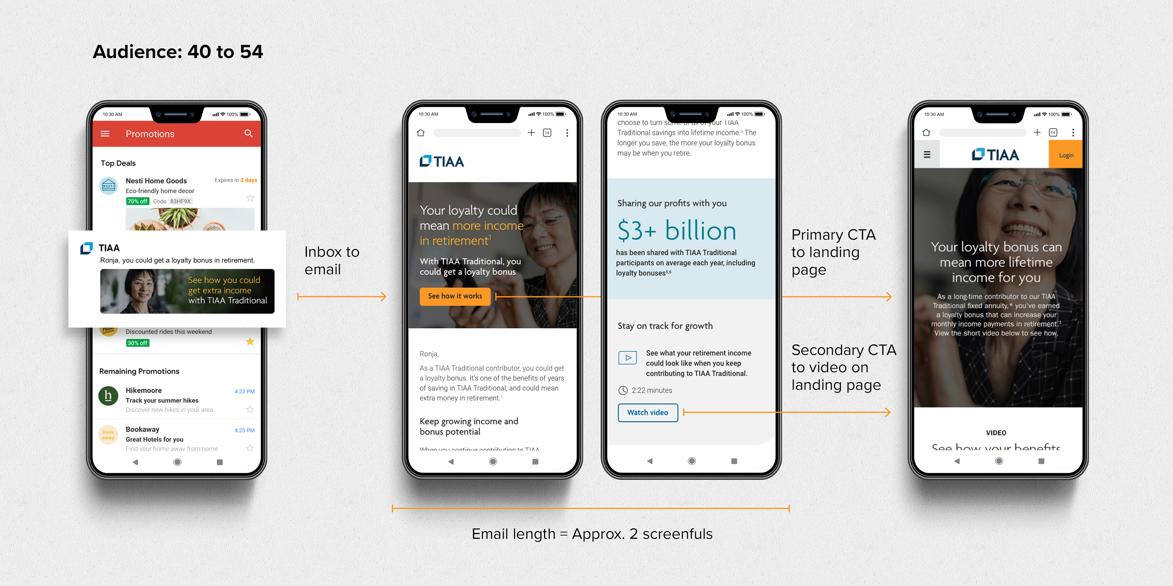
Audience, ages 40 to 54
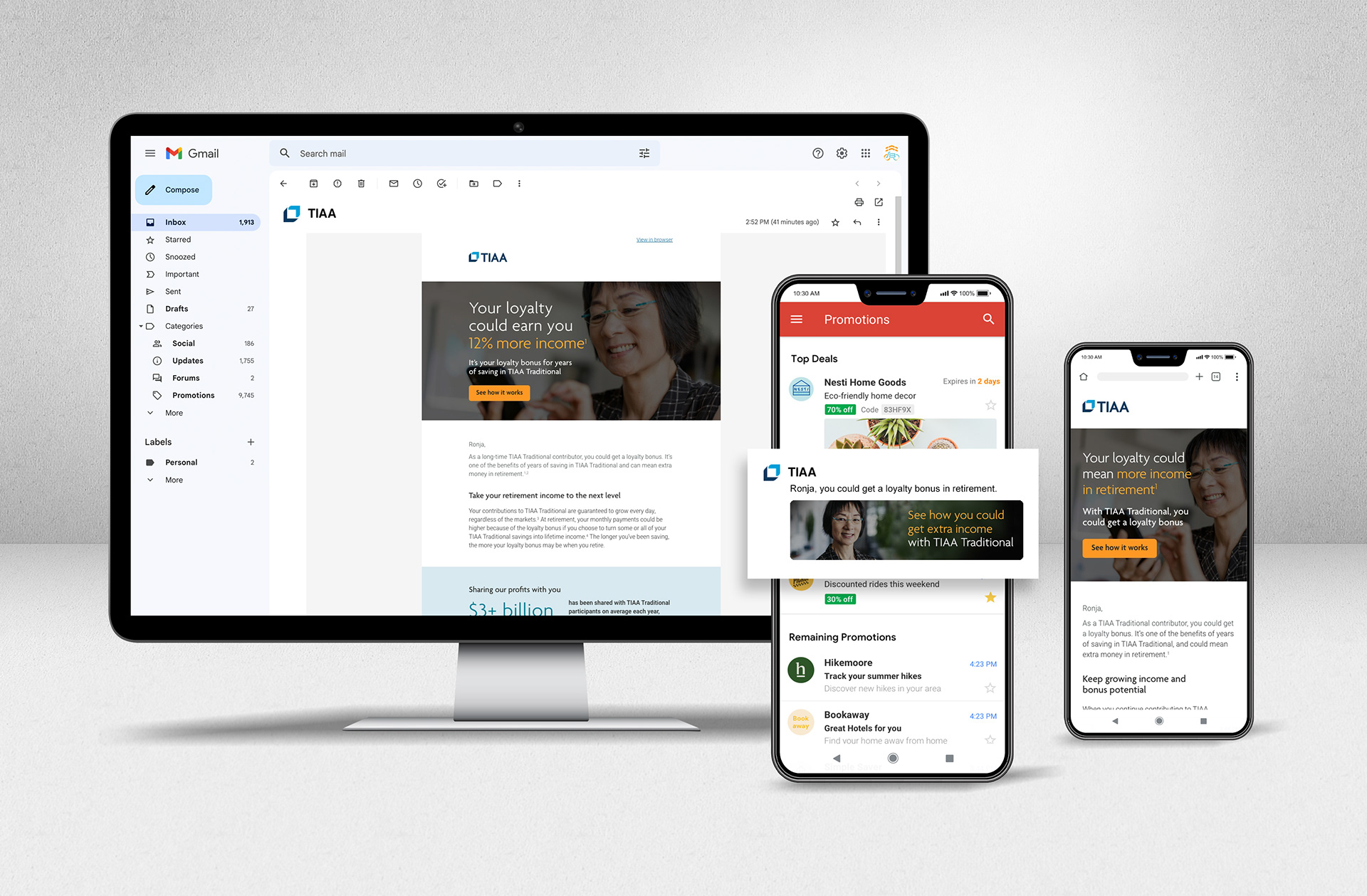
This age group largely checks emails on their phones, so thinking mobile-first was a must and a great opportunity to use the Gmail Promo Tab code as the first user impression. I initiated the use of this code for our email development initiatives. We're able to show an image within Gmail's inbox, plus other stand-out elements.
The end-to-end experience
1) Gmail inbox > Promotions tab > personalized subject line > promo image
2) Scenario 1: Email > hero with primary CTA to landing page for general info
Or
2) Scenario 2: Personalized greeting > scroll once > secondary CTA to landing page where video is located under the hero
*Note: I did not design the landing page.
SEGMENT II
Audience, ages 55+
This age group, especially the older portion, largely checks emails on their computers, and much less inclined to check the Gmail Promo tab, so I was less concerned about using the Gmail Promo code.
And for this audience, the business requested 3 CTAs.
Accessibility in email development
Acting as an audience advocate, I put myself in their shoes with each project. Older audiences have higher rates of visual impairment amongst other needs, so I kept the colors subdued and the overall layout clean.
The end-to-end experience
1) Gmail inbox > personalized subject line
2) Scenario 1: Email > hero with primary CTA to landing page for general info
Or
2) Scenario 2: Personalized greeting > scroll once > secondary CTAs of the video on the landing page or webinar at event.on24.com
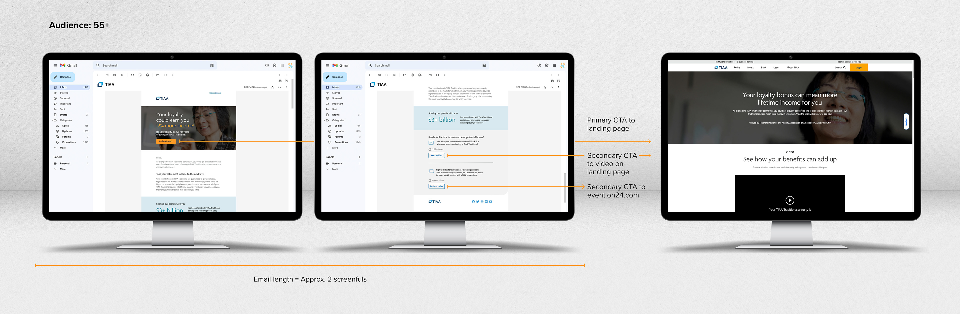
*Note: I did not design the landing page.
Conclusion
By using the same content in each phase of the experience, creating visual hierarchy for each call to action, and keeping the overall visual treatment and content relevant to your intended market, you can create a logical path from the initial impression (inbox subject line and promo graphic) to the email itself (narrowly targeted content to help the user care about what you're telling them) to the final destination (landing page and conversion potential).
*Please note, I am an in-house designer working with the pre-established brands of EverBank, TIAA, GuideWell, The Jacksonville Jaguars, and the Title IX Campaign.