An outside agency created the distinct style of the Title IX campaign as a sub-brand of TIAA, and some projects came in-house. For me, an email campaign and large-scale art.*
EMAILS
A challenge from the start
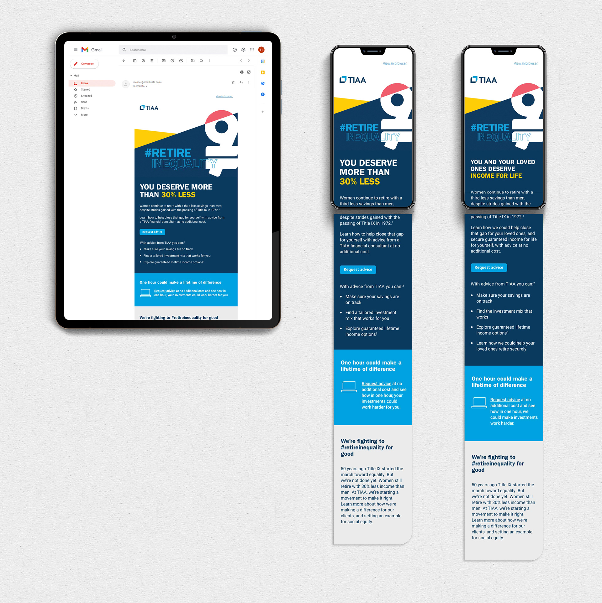
Initial requests: Only one email; Double CTA; both CTAs "above the fold"; include a video element, making that a total of 3 clickable elements, plus a diversion from the email itself, making it a risk for retention; messaging must resonate with more than just women; explain what Title IX is; explain why one should speak with an advisor; and the email type must work as both an "awareness" and "conversion" email.
This could turn into ill-targeting and cognitive overload.
My approach
I proposed segmenting one email into two with tailored content — "women" and "neutral". Then create a third hyper-focused email follow-up.
I kept a bold graphic in the hero with the headline. Concise intro about Title IX and speaking with an advisor. One primary CTA beneath the intro. The body explains the benefits. Then the primary CTA again as a closing reinforcement.
At the end is a callout box serving as the "awareness" aspect with the video as a body hyperlink. Deemphasizing the video and keeping most of the Title IX content at the end keeps the focus on conversion, and may help prevent people from leaving the inbox.
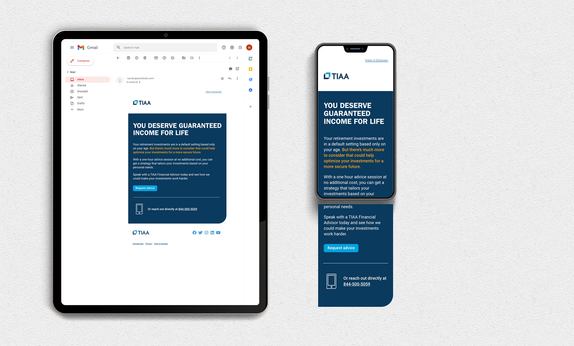
Email follow-up
This serves as the hyper-focused, conversion-only component emphasizing the action. It includes a headline, concise copy, and the double CTA. I made the secondary CTA more subtle so as not to compete with the primary.
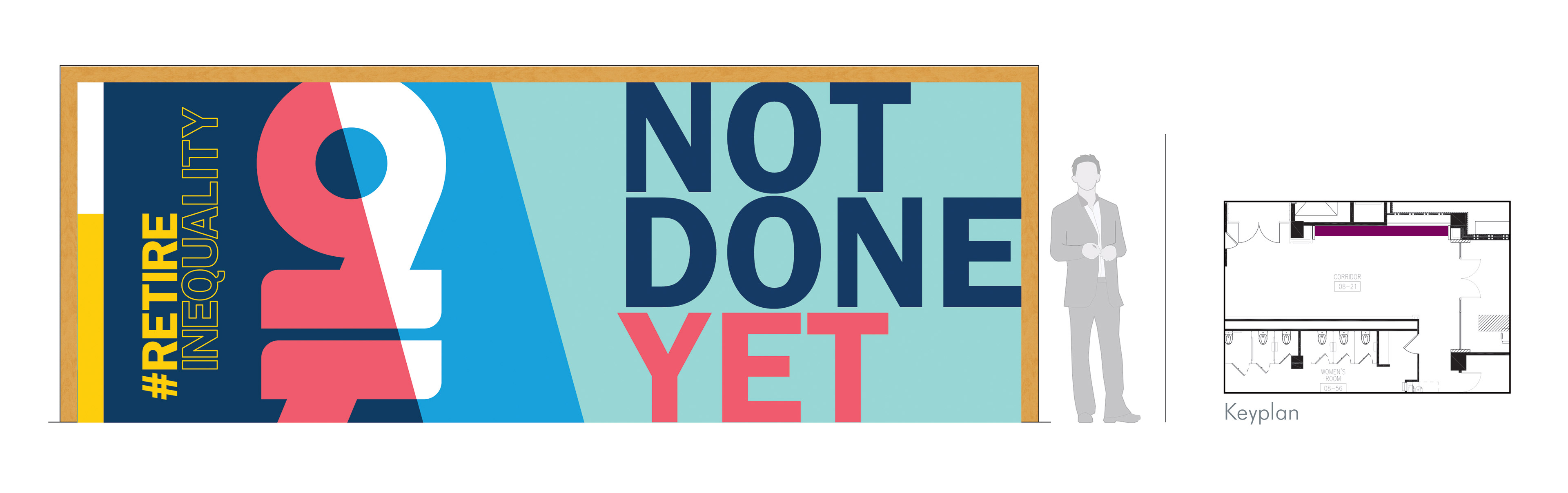
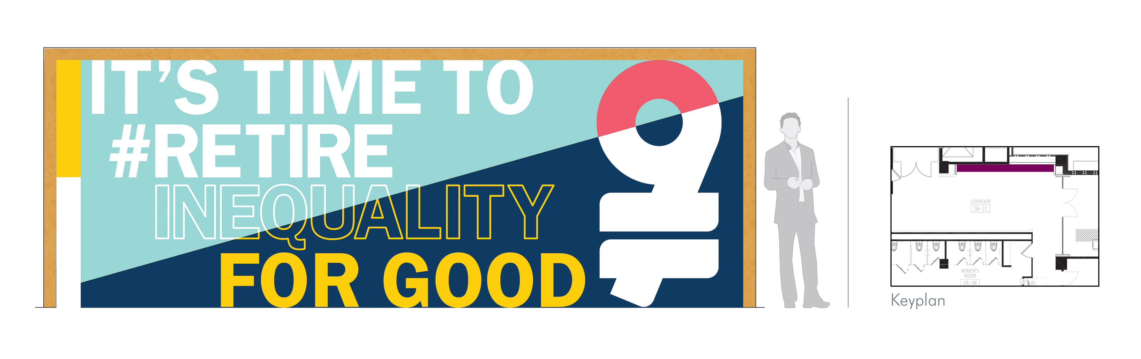
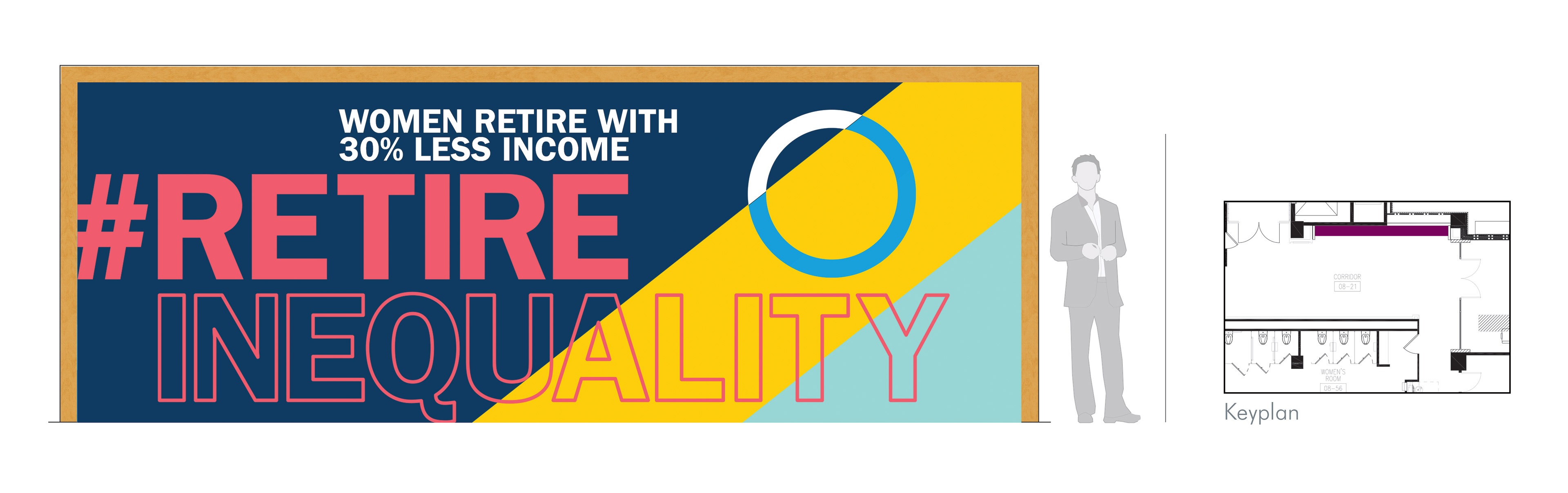
OFFICE ART
The brand for Title IX has a lot of design elements, so for the large-scale art, I tried to keep it as minimal as possible, emphasizing type and giving purpose to the geometric shapes.
*Please note, I am an in-house designer working with the pre-established brands of EverBank, TIAA, GuideWell, The Jacksonville Jaguars, and the Title IX Campaign.